It is currently Mon Nov 11, 2024 9:28 pm

All times are UTC


THE PROP DEN is primarily a Darth Vader Prop Discussion Board, but we also deal with other Star Wars Props as well as Prop Replicas from other movies. If you do not yet have an account, set one up, sign in and jump into the Vader Prop Discussions!


Post new topic Reply to topic  [ 186 posts ]  Go to page 1, 2, 3, 4, 5 ... 13  Next
Author Enter your Message here
 Post subject: Modification of a Rubie's Supreme Helmet's facemask
PostPosted: Mon Jan 08, 2007 5:52 am 
User avatar

Joined: Thu Dec 21, 2006 10:46 pm
Posts: 5241
Location: San Jose, CA
NOTE: I have divided this initial post up to multiple posts, so the first 3 replies may seem out of place. But I'm done moving content around, so please don't let that discourage you from replying and taking part in the conversations on this thread! - Mac.
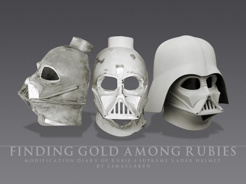

Image

Foreword

It's been a long time since an affordable life-sized helmet and mask of Darth Vader was available. Perhaps like you, I was one who purchased it thinking it to be an affordable "ultimate" Vader until I stumbled across fan websites that pointed out significant inaccuracies to the Rubie's product. After studying screen captures and prop recasts, I concur. And if your goal is costuming, part of the challenge is to portray the character of Vader without the distraction of a helmet that looks too wide and distorted. In other words, you want people to look at the costume, not end with seeing the costume but instead see the character.

So here is my contribution to The Prop Den, with special thanks to NoHumorMan for his kind encouragement!


Is it worth modifying?

4/18/13 - There are people on a budget, so the Rubie's is appealing on that basis alone. However, the Rubie's has increased in price. You can no longer get it super cheap. It's currently within the $95-110 range (plus S&H). People may mean well to tell you to buy this and make some slight modifications and that will make it "accurate". Although they mean well, this advice doesn't take into account the costs of tools, materials, etc.

Here is an infographic on the hidden costs of modifying a Rubie's.

Image

If you already happen to have a ton of the necessary tools, equipment, paints, sandpapers, files, etc. around, then more power to you. If you don't, then consider a helmet kit that requires minimal fuss before taking paint. Your costs here can exceed that of an unpainted helmet kit like "Darth Ugly".

Also, know that you are working with a very difficult material - plastic. It gums up your tool bits if you work too quickly and let things heat up. Many tutorials on the Net suggest accurization mods, but bear in mind that the shape has been warped and biased to remove undercuts. The entire head shape is wrong. The important irregularities, bumps, etc. have long been sanded out. Even if modified, it can have a great look, but it will never be on par with a cast-from-original-mold helmet. So bear these limitations in mind.


Differences between Rubie's and the Original
Image
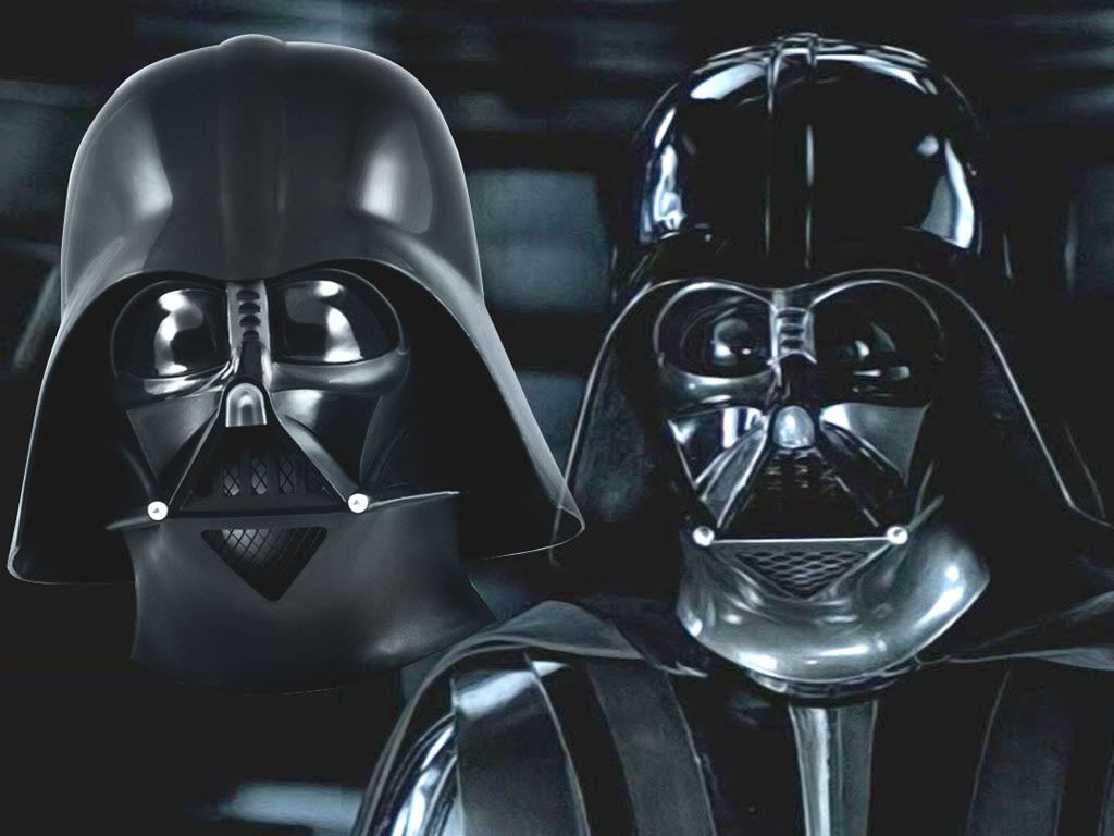
(Above: A Tale of Two Vaders. Left, we have a Rubie's Supreme Darth Vader helmet in original, unmodified condition. Right, screen-used ESB).

The Rubie's is based off of the same template as once used by Don Post Studios. Rubie's Costume Company acquired the license and that template. The template consists of an ESB mask but a ROTJ-style dome. Contrary to it being popularized as Revenge of the Sith (which by nature is symmetrial), it's not. The Rubie's is asymetrical.


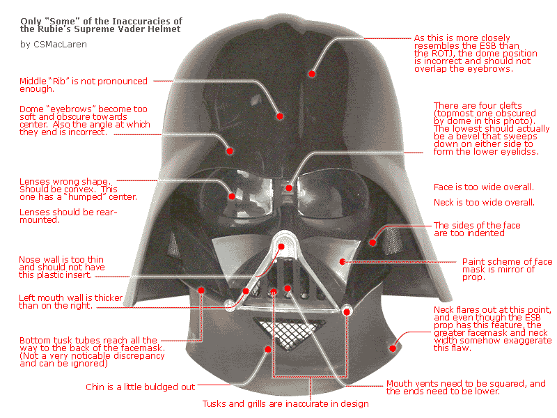
Inaccuracies of the Rubie's facemask
Image

1. The lenses are front-mounted and should be rear-mounted. Further, the lenses are the wrong shape. There should be a natural curvature, not like someone used their thumb to press into the plastic while it was hot.

2. The bridge of the nose is off-center. You see four clefts into the bridge. There should be three. In reality the forth cleft is more of a depression or bevel, in that the surface of the bridge ends there and sweeps down to form the lower eyelids.

3. The five mouth vents are round-ended and should be square ended. (Addendum 1/9 - There is an incline at the bottom of each vent. These can be removed, but overall the vents should end lower. More on this later.)

4. The eyebrows lack the "frown" found on the props (a loss of "menace" that makes Vader what he is)

5. Of the triangular mouth, the left mouth wall is thicker than the right and the bottom. On the prop, they should be of similar thickness.

6. The nose has a piece of plastic stuck in there and it should be painted. The nose wal here is too thin, but if made thicker, it should be thinner than the mouth walls.

7. The alternating paint scheme (in case you hadn't noticed that the original props had one) is reversed. The upper left eyelid area and the right cheek should be highlighted (among other things).

8. The neck on the right side (as you face the helmet) is flared out.

9. The facemask, overall, is very wide.

10. The neck is very thick and the chin is somewhat buldging. It needs to be more contoured.

11. The dips beneath the lower eyelids are small and incorrectly shaped and positioned.

The helmet has a center bevel but it's obscure. The "eyebrows" of the helmet are also obscure.

Currently in this tutorial, I'm not going to address that (at least not for now).


So.... Who Cares?

Whew, that was a mouthful, huh? The question is: who cares? Perhaps 90 percent of dedicated fans out there will not notice these discrepancies. Casual fans might not know what on earth you're talking about. Students of sculpture recreating Michelangelo's "David" will study the statue for years and still fail to capture all the subtle duances. But when you do close in on that final 10 percent, somehow people subconsciously recognize what you're doing.

It starts with how much you want to refine your own eye to recognize the characteristics of a screen-accurate Vader. One can only study screen captures for so long. Vader is one of those man-made hand-made marvels that deserve to be studied in three dimensions. What I needed was a valid basis of comparison. Fortunately I was blessed with the opportunity to invest in a low number Don Post Deluxe fiberglass helmet in original condition. This was licensed and signed off by Lucasfilm. While stated on the Certificate of Authenticity as being of Empire Strikes Back molds, the helmet middle bevel suggests Return of the Jedi. Regardless, it's a marvelous study piece. It has such character that it feels like Vader's frickin' head sitting right there on my desk!

When you examine the Rubie's side by side with something that was cast (or recast) from original Lucasfilm molds, it's like comparing a Lamborghini-looking Honda upgrade kit with the real Lamborghini. One is Lamborghini-looking, and the other is pure gold. By itself it looks great, but even someone like me -- who isn't really that into cars -- can tell the difference.

If you need inspiration to modify your Rubie's, consider this: it's like the tremendous attention to detail by propmakers in "The Lord of the Rings". The camera may never directly focus on the detail of the props but they all help in increasing the suspension of disbelief, thereby increasing the reality of the characters.

It's one thing to look kinda like Vader. It's a whole other thing to BE Vader in someone's eyes!

One of the reasons why I started documenting my modification is to see if a plain beginner like me could do this. I don't have everyone's talent in sculpting or painting. But I have had everyone's encouragement and great advice, so a big "Thank You" for all who have given me your support in this process.

Further, I hope this tutorial will help someone out there. I have seen two or three tutorials, but none of them addressed the mouth area, the bridge of the nose, and the frown.

Most tutorials basically reduce the four clefts (or "ridges") in the bridge of the nose and reduce them to three, but don't address how the surface of the bridge of the nose sweeps downward on either side to form the lower eyelids.

Some indicate the lack of symetry to the helmet, but don't really correct the thin mouth wall on the right.

This tutorial will help any of you who are on a budget and don't want to spend hundreds to buy a fiberglass screen-accurate helmet. It won't make the Rubie's totally screen accurate but it will make it look far more pleasing to the eyes.


Is modification really necessary?

4/18/13 - Image
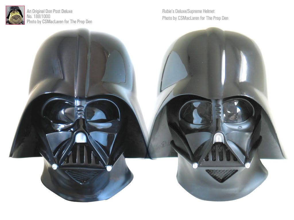
(Above: Did these helmets come from the same template? You decide! Answer below!)

Is modification really necessary? It depends. Any degree of modification would be an improvement. I've seen people do nothing but shoot automotive paint, and from a distance it was marvelous. The secret to Vader looking good is basically what you think you see, as opposed to how the prop actually appears. The helmet is very much about the way it responds to light and also what remains hidden in shadow, obscure.

The above shows how dumbed down the Rubie's plastic helmet is compared with a Don Post Deluxe. And the Don Post Deluxe is definitely dumbed down compared with the screen used original. The Rubie's Fiberglass limited edition is very similar to the Don Post Deluxe, but I feel the old Don Post has a better paint job to it.

Notice how the DP DLX, despite its shortcomings, looks marvelous and organic. The Rubie's looks forced. It's face is narrower, possibly to make it easy to remove from the molds as these were formed by injection-molding. The Rubie's also looks oversanded.

So count the costs... have fun, and good luck :thumbsup


Last edited by CSMacLaren on Thu Apr 18, 2013 11:17 pm, edited 8 times in total.

Top
 Profile  
 
 Post subject:
PostPosted: Mon Jan 08, 2007 11:26 am 
Site Admin
User avatar

Joined: Fri Sep 29, 2006 1:25 pm
Posts: 2871
Good progress so far :thumbsup


Top
 Profile  
 
 Post subject:
PostPosted: Mon Jan 08, 2007 1:22 pm 
User avatar

Joined: Tue Oct 17, 2006 10:38 pm
Posts: 816
Location: Essex UK
Excellent stuff man i have seen a couple of rubies tutorials online but nothing this indepth its usually just a do this do that kind of thing with no real explanation of methods or reasons
looking great so far :wink:


Top
 Profile  
 
 Post subject:
PostPosted: Mon Jan 08, 2007 2:34 pm 
Site Admin
User avatar

Joined: Thu Aug 31, 2006 8:58 am
Posts: 10916
Location: Denmark
Excellent "fattening up" of the right side of the mouth (left on the face) and I especially like your new dome position - was that caused by pulling in the right side of the neck an face?

Though, I'm not sure why you added material to the lower lip or the nose bridge where the three ridges are or the eyebrows as those were pretty - and I stress pretty, not completely - accurate to the real thing.

Definitely interested in seeing more progress. And the new dome position makes an awesome improvement, imo! :thumbsup


Top
 Profile  
 
 Post subject:
PostPosted: Mon Jan 08, 2007 9:52 pm 
User avatar

Joined: Thu Dec 21, 2006 10:46 pm
Posts: 5241
Location: San Jose, CA
Thanks for the kind words, guys! I welcome everyone's feedback!

Okay, onto the next steps of the tutorial:

Heat Treatment

Image
(Above: Left, before heat treatment. Right: After heat treatment modifications.)

The easiest way to manipulate and reshape the Rubie's is through softening it with heat, then bending it to the desired shape, and "freezing" it in its new position by cooling it under running water.

The Rubie's appears to be injection molded plastic. Someone suggested it was PVC. At any rate, plastic becomes soft with heat. Some have treated the plastic in hot boiliing water, while others have baked it (watch out for fumes). My approach was to purchase a $30-40 heat gun and to give it heat at approx 1100F. If you hold the heat gun too close, the plastic may start to blister (don't worry, it's nothing you can't sand or file out later).

As you expose it to heat, you may start to see the mask sag because the plastic is becoming less rigid. The goal is to get it soft, and then cool it under a tap of running cold water.

The heat gun approach allows me to specifically focus on areas so I can to them a bit at a time. Here's what I've done.

1. The most obvious flaw is the neck flare on the right of the neck. I took this in.

2. Not so obvious is the thickness of the neck. Once the neck flare was corrected, I sought to push the neck line upwards and inwards to increase the contouring.

3. The chin (with the triangular vent) buldges out a little too much. So I used this opportunity to push this in a little. What i couldn't push in I later on filed down with a file.

4. The left side of the facemask sticks out more than the right. This is true of the prop, only the mask is, overall, very wide. It's not so noticable here due to perspective distortion from my standing directly over it, but refer to to the previous photo.

5. The rear opening of the mask was very wide. I used heat to to bring the sides closer together.

6. Lastly, I changed the angle of the helmet receiver. People sometimes wonder why the flare on the back of the helmet doesn't always cover the back of the neck suffiently. Adjusting the receiver is part of a solution to allow the helmet to not only be mounted at a different angle but to allow the facemask to be slightly recessed and overshadow the eyes a bit. This is more of an A New Hope (Ep. IV) style but it looks very flattering to the Rubie's (shown later).

Image
(Above: how it looks after heat treatment, photographed about 4 feet away).

Wow, that was a lot of work. Watch out for the fumes. I did this over an oven range with the overhead fans turned on. When sufficiently hot, I ran it over to the kitchen sink, bend it to shape, turn on the faucet, and with it held bent I'd cool it under running water. In general, it didn't get too uncomfortable using my bear hands. Feel free to use gloves. I also had some blue masking tape on areas where my hands would be.

In general, when heating one area, you'd have to generously heat the surrounding area, otherwise the "memory" of the plastic may work against you.

In the right photo you can see the mask looks more symetrical. I don't believe in correcting asymetry for symetry's sake. Rather I was going for a good fit -- anything from looking like I had a big head and small body!


Regarding the Skewed Mouth

I found this part to be the most difficult because a huge portion of the mask would need heat and would potentially undo the incremental changes I had done up till this point. I may have been able to move it up a hair, but ultimately decided to not do any more with it.


About Liner Removal

Note: removal of the inner foam liner isn't necessary for this step. However, the liner will start disengaging due to heat. The heat gun is your friend if you want to remove the liner in one piece as it will melt the adhesive.


Last edited by CSMacLaren on Tue Jun 12, 2007 5:04 pm, edited 6 times in total.

Top
 Profile  
 
 Post subject:
PostPosted: Tue Jan 09, 2007 3:46 am 
Site Admin
User avatar

Joined: Tue Sep 05, 2006 12:23 pm
Posts: 1197
Location: Turkey
Very cool!

Love seeing different rubies upgrades.


Top
 Profile  
 
 Post subject:
PostPosted: Tue Jan 09, 2007 4:55 am 
User avatar

Joined: Tue Jan 09, 2007 4:46 am
Posts: 97
Location: Canada
Great progress thread.


Top
 Profile  
 
 Post subject:
PostPosted: Tue Jan 09, 2007 5:56 am 
User avatar

Joined: Thu Dec 21, 2006 10:46 pm
Posts: 5241
Location: San Jose, CA
Thanks, fellow Darths!

Now, the next steps:


Physical Modifications

Image

After removing the lenses, I had to remove the surfaces to which the lenses would normally lay against. A dremel tool disc could work but heat and plastic gunk up the disks pretty badly. Using industrial razors to cut grooves seemed to work.

I sanded the helmet down (be careful not to sand too much down. Try 220 grit. The idea is to give a surface for the primer to grip. I made the mistake of using 80 and 120 grit at someone's suggestion, and the deep scratches and lifting/scarring of the material is very difficult to smoothe out.)

Here I've partially rebuilt the eyes. The bridge of the nose is off center so I added more material (and later refiled down). Notice I added a frown and added more material for the eyebrows. If you add material for a center "frown" like I did, figure making this longer if you're going to make a "Reveal" helmet.

Image
(Above: White areas are QuikPlastic. Gray portions of mouth were something else which I abandoned in favor of QuikPlastic).

I had originally used PC Plumbing Epoxy putty but later found this to be a mistake. It hardens in 5 minutes and when it hardens, it's like a rock (try filing and sanding a rock). I later moved to something called QuikPlastic (which was available at Home Depot). It comes in a tube, with an inner layer of white and an outer layer of blue. When you cut the size you want and knead it, it becomes light blue and has a longer working time (and can be softened with a heat gun before it cures). It's advertised as being compatable with PVC plastic, and when hardened can be sanded and filed.

It was a blast to work with. It doesn't spread, so you end up needing to get some waxy slippery-surfaced plastic spreaders (like the ones they use to spread Bondo).

It doesn't stick to you if your hands or your spreader is wet. BIG HINT: it may not be spreadable but it is pressable so if you wet the surface of your spreader and press it, you can potentially get a nice smooth surface and reduce your sanding needs. I've also cut my soft spreader into curved pieces to access difficult areas. Use your imagination!

Of course, it's important not to trap water beneath a QuikPlastic application, but it doesn't seem to be bothered by water. So pat off excess water or just leave it alone to dry out in the sun,

Also, if you have a clutchpencil eraser (the white kind) and dip it in water, you could potentially use that as a prodding and shaping tool. I also cut out pieces of my spreader to access hard-to-reach areas like the insides of the eyes.

You may want to experiment with manipulating it after giving it some time to partially cure.

Image

So above is an early stage and initial effort to refine the nose and mouth (it's been sanded, Quikplastic reapplied, resanded, refiled, etc. many times since). Here, I've begun filing out the five mouth vents. I've widened the right and bottom mouth walls, filled in the dimples beneath the lower eyelids (we'll grind new ones later). Also you can see the bridge of the nose has more material.


Last edited by CSMacLaren on Fri Jan 19, 2007 6:50 am, edited 3 times in total.

Top
 Profile  
 
 Post subject:
PostPosted: Tue Jan 09, 2007 5:56 am 
User avatar

Joined: Thu Dec 21, 2006 10:46 pm
Posts: 5241
Location: San Jose, CA
Initial Priming

Sometimes surfaces are hard to see when they're black and white, so primer helped me establish what I needed to work on next. Here is an initial stage.

Image

As you can see, the 80 grit sandpaper (due to bad advice) is sticking out like a sore thumb. My "frown" is looking good, but the center needs to be smoothed out. Inset is my ANH helmet. Okay, the Rubie's is starting to show promise.

Image

The eyes lack a certain meneace. Vader needs to look angrier. So, more filing, more sanding, etc.


Top
 Profile  
 
 Post subject:
PostPosted: Tue Jan 09, 2007 5:56 am 
User avatar

Joined: Thu Dec 21, 2006 10:46 pm
Posts: 5241
Location: San Jose, CA
Patience, a Jedi must have Patience!

Image

Patience starts paying off. Continued work to the bridge, the frown, and the mouth.

Image

Not bad, but the bridge of the nose looks a bit unrefined. However, the surfaces have been sanded down to the 80 grit scratches are starting to disappear.


Top
 Profile  
 
 Post subject:
PostPosted: Tue Jan 09, 2007 5:57 am 
User avatar

Joined: Thu Dec 21, 2006 10:46 pm
Posts: 5241
Location: San Jose, CA
Helmet Positioning

As mentioned before, I did some heat treating and correction to the facemask's receiver. Ultimately I'm going to have to try some cut-up mousepads and velcro to tweak this, but this is how I intend to position the helmet.

Image

Notice that from this perspective, the rear rim of the helmet covers the back of the neck easily. Some people try to add an extra inch or two do the rim of this part -- the "flange", but thus far it's unnecessary. It could also be argued that in TESB there are shot where Vader is looking straight on, and the back of his neck is exposed.


Top
 Profile  
 
 Post subject:
PostPosted: Tue Jan 09, 2007 5:57 am 
User avatar

Joined: Thu Dec 21, 2006 10:46 pm
Posts: 5241
Location: San Jose, CA
Almost Done

Image
(Above: "Then and Now". Left: Work in progress. Right: Rubie's in original stock condition).

Image

Image

Image

Then someone said, "why not make the clefts in the nose more square ended". Oh no... originally I did the bridge of the nose as a trapezium. On the prop it's more rounded.

So this was my opportunity to go refine the bridge. Again, that forth cleft is a bevel that draws a line down to the lower eyelids.

Image

Image
(Above: after a little more sanding, filing, and primer.)

This is currently a work in progress. More later!


Top
 Profile  
 
 Post subject:
PostPosted: Tue Jan 09, 2007 6:19 am 
User avatar

Joined: Thu Dec 21, 2006 10:46 pm
Posts: 5241
Location: San Jose, CA
Refinements... A-GAIN

Just when you're about ready to prime and paint, someone says "Oh the ridges in the nose need to be more squared" or some guy who previously encouraged you whose name rhymes with "NoTumorMan" suggests something isn't completely screen-accurate. :eek

Image

Initially I responded to one fan's indication that the ridges (or "clefts") of the bridge of the nose should be rectangular. The peak of curvature of the nose of the Rubie's is off center. I originally simply padded the lacking side and used a round file to shape the clefts.

However, this in fact made the bridge of the nose unnecessarily thicker.

Another thing I only noticed today is that the "frown" of Vader's brows -- that middle bevel -- actually flows into the bridge of the nose (a subtlety I had only noticed).

In the above photograph, I had filed down the bridge to make it softer. The clefts were more rectangular but not rectangular enough. I was content to leave it alone but NoHumorMan mentioned that the way the eyebrows joined with the bridge of the nose wasn't quite screen accurate.

The need to rework the eyebrows gave me the motivation to attack the cleft issue in the same effort.


Why the Eyebrows and the Frown?

The eyes of any person convey their intent and character. The Rubie's eyebrows end somewhere above the top cleft of the nose bridge. This, in conjunction with its thin eyebrows, make Vader's eyes look less angry and more thoughtful. To me, it was critical to add the menace back to the facemask that implies, "I find your lack of faith disturbing" and that you might get shoved out into an airlock by the Dark Side of the Force!

I added QuikPlastic to thicken the eyebrows and brought the eyebrows lower. On the Don Post Deluxe the eyebrows terminate where the top cleft just begins.

However in the above photograph I overpronounced the frown.

Here, below, I took the opportunity to remove the "uni-brow" look.

Image

Ahhh... much better. Compared with earlier photos towards the beginning of this thread, the bridge of the nose is narrower and the curved surface is more subtle. Before it was wider, thicker and more trapezium. Well it's still a bit of a trapezium.

Now, the surfaces of the bridge of the nose start to flow into the frown. Now the center buldge or bevel of the frown is about 1-1.5". If you are a "Reveal" mask maker (i.e. all the under-the-helmet gagetry revealed when the helmet is off, as seen in ESB and ROTJ ) then you may want to lengthen this.

Here you can also see that the forth cleft is actually in a correct position to be the bevel where the bridge surface ends and sweeps down on either side to form the lower eyelids. Some tutorials show you to basically plug up the four clefts and re-grind a new set of three. But the clefts are in their proper positions already.


Last edited by CSMacLaren on Tue Jan 09, 2007 9:28 am, edited 1 time in total.

Top
 Profile  
 
 Post subject:
PostPosted: Tue Jan 09, 2007 6:42 am 
User avatar

Joined: Thu Dec 21, 2006 10:46 pm
Posts: 5241
Location: San Jose, CA
A Word on Priming and Sanding

After testing a few brands of sandpaper, my sandpaper of choice is this 3M black colored wet sanding sandpaper. Ironically, each sheet's reverse side not only shows the grit level, but this is actually marked "IMPERIAL"!

Now I am not a professional painter nor a sander, so if any of you sanding/painting experts can chime in, that would be valuable.

Initially, after applying QuikPlastic to your facemask, you will have basically a black and white monstrosity, and it may be difficult to tell if the surfaces are as continuous and graceful as you want. You can feel them, look at them from different angles, etc. but sometimes priming is the best way to tell.

I used Duplicolor gray sandable Filling Primer. Primer comes in different colors, but gray is a neutral color. I suppose black could have been an interesting choice, now that I think about it, but the gray allowed me to instantly spot deficiencies in my surfaces.

Regarding sandpaper, I think the best grit to start with is 220 grit. It helps for there to be some friction to the surface to which you apply Quikplastic, but it appears that the facemask doesn't need sanding to receive a coat of primer. But it doesn't hurt either.

220 grit seems to be the least "offending" to me. I was originally told to sand it down with 80 grit, and the coarsness tore into the plastic and left scratches that might as well have been scars. Scratches can be filled, but scars are above-surface and are a little more difficult to deal with.

I sprayed outdoors on an old shower curtain so there was plenty of venthillation. I followed the instructions on the Duplicolor can and sprayed according to the specified distance. It's important (but not critical) to not overspray and not move in too closely because paint would gather into droplets (but you can sand those off easily).

Thus far I have ended up with several coats of primer.

As much as I wanted to proceed with painting, I'd find annoying issues, such as the Quikplastic surfaces not blending properly with the Rubie's plastic.

Very soon you will learn that wet sanding is your friend. Wet sanding is basically dipping the sandpaper in water and sanding gentlly. It turns out that it creates a slurry, and the slurry contains fine particles that being smoothing things down considerably. Sometimes when I'm trying to do some refinement reshaping, I may have to dry sand, and if I want to blend the results, I dip the sandpaper in water and proceed with wetsanding -- and I go back and forth.

"Wet-standing is your friend," I keep repeating to myself!

Gee, this is hard... but wait: wet-sanding is your friend!

Miore to come. Stay tuned!


Top
 Profile  
 
 Post subject:
PostPosted: Tue Jan 09, 2007 7:21 am 
User avatar

Joined: Fri Sep 15, 2006 7:57 am
Posts: 941
Location: Germany
Very impressive work you did on this one !!!

I think it would add a lot to the look if you also modified the Dome by
adding a sharper center stripe and thicker edges to the flaps ... just a
thought - :rolleyes


Top
 Profile  
 
Display posts from previous:  Sort by  
Post new topic Reply to topic  [ 186 posts ]  Go to page 1, 2, 3, 4, 5 ... 13  Next

All times are UTC


You cannot post new topics in this forum
You cannot reply to topics in this forum
You cannot edit your posts in this forum
You cannot delete your posts in this forum
You cannot post attachments in this forum

Jump to:  
cron
Blue Moon by Trent © 2007
Powered by phpBB © 2000, 2002, 2005, 2007 phpBB Group
Hosted by Freeforum.ca, get your free forum now! TOS | Support Forums | Report a violation
MultiForums powered by echoPHP phpBB MultiForums