I was recently asked to help determine the size relationship between the ANH dome and the ANH mask. There is often a difference between how the prop appears in real life versus how it's filmed or photographed. Camera angle, lighting, dome positioning, etc. all come into play and makes this a fascinating topic.
More specifically, it was to ascertain whether or not the TM dome was proportionately too large for its own mask.
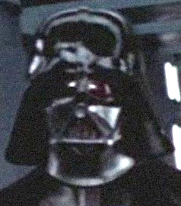
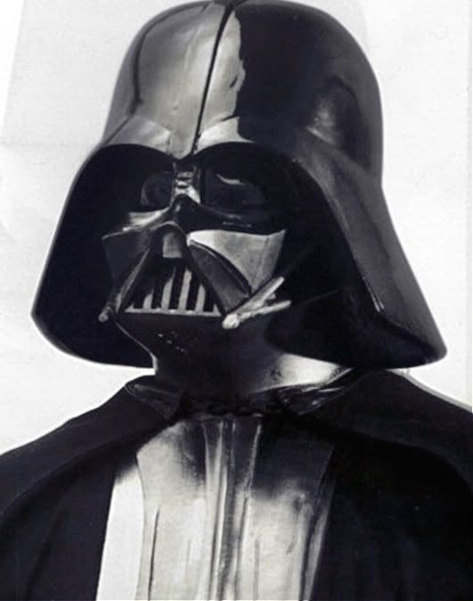
Image of the TM mask courtesy of its owner who wants to remain anonymous. The forward tilt of the dome is not the same as that of the screen-capture, but this is all I had to work with.

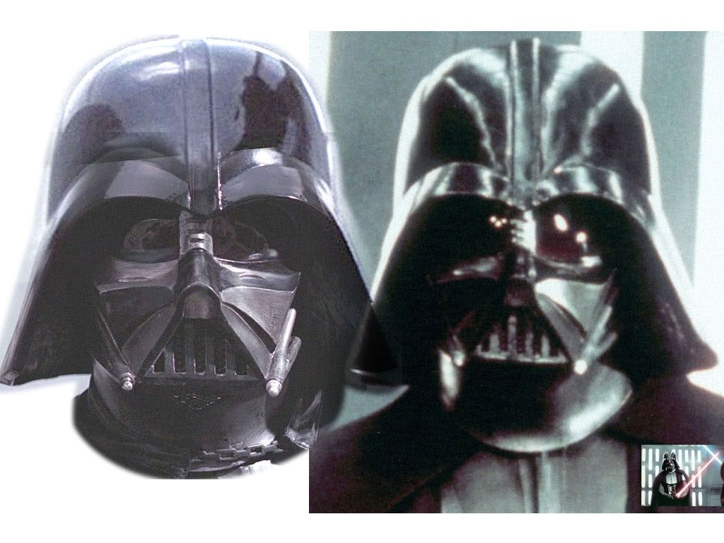
Now notice the profile of the helmet to the right. My initial impression was if the dome was too wide, as the dome-to-flange angle was more subtle than I remembered it.
When I did an overlay, it turns out my perceptions were wrong.

It turns out the TM overlaid extremely well onto the screenshot of the screen-used helmet.
Then it dawned on me: much of the time, our impressions of Vader come from popular pictures or the shots that we happen to view the most.
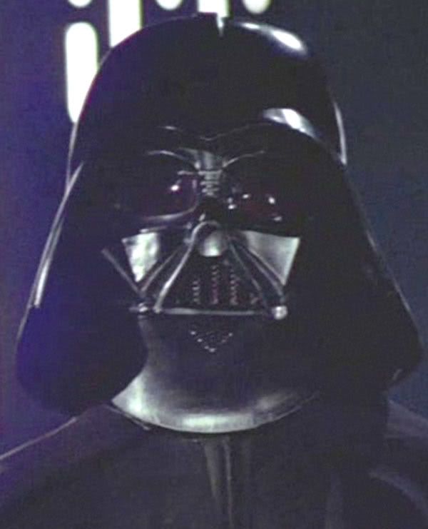
Many of you have seen this photo:
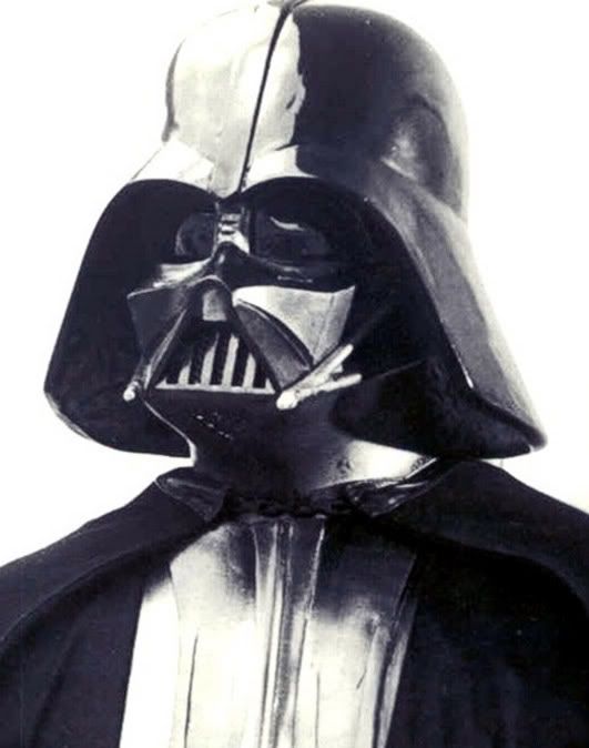
Well, this looks like the dome cap is much narrower than the TM, doesn't it? But what if I were to tell you that it was lighting that created this impression? You see, due to lateral light reflecting off the gloss paint, you don't truly see the profile.
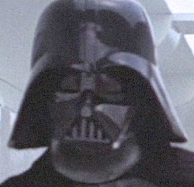
Well, it turns out the above shot seems to have come from this shot:
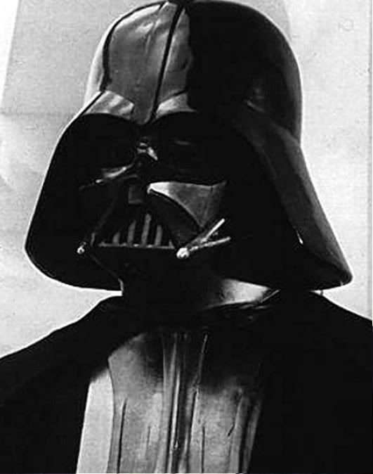
In this above shot, you can see the profile of the helmet more clearly, but because there is light reflecting off of the (camera's) left side of the dome, it creates the illusion of a narrower dome cap.
I thus did an overlay to ensure that both images were aligned as closely as possible to make sure the details and features matched up, and then created an outline of the dome:
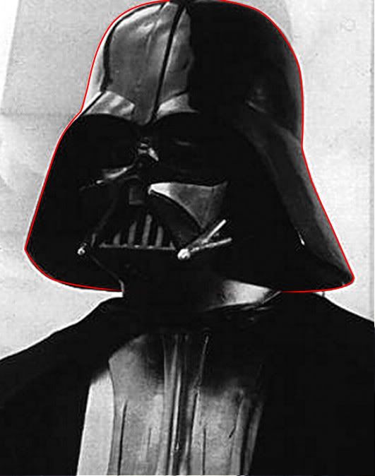
And I placed the outline on the first image.
Would you have believed me if I told you that in reality the dome looked like this:
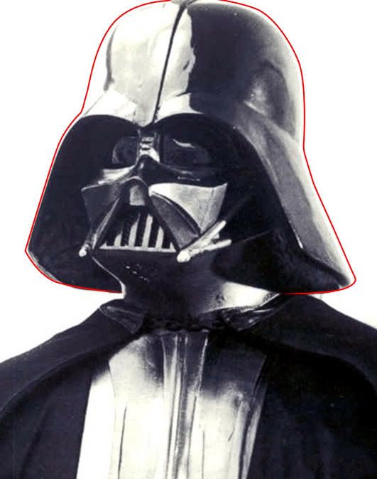
So now in this final image, I've removed the red line but darkened its inside space, and made the darker image a little transparent.
This is what, I believe, the ANH dome really looks like, in this picture.
The domecap certainly looks a lot broader.
By the way, this is actually the screen-used. The dome features match up with screen-caps.