It is currently Sat Oct 05, 2024 7:26 pm

All times are UTC


THE PROP DEN is primarily a Darth Vader Prop Discussion Board, but we also deal with other Star Wars Props as well as Prop Replicas from other movies. If you do not yet have an account, set one up, sign in and jump into the Vader Prop Discussions!


Post new topic Reply to topic  [ 186 posts ]  Go to page Previous  1 ... 4, 5, 6, 7, 8, 9, 10 ... 13  Next
Author Enter your Message here
 Post subject:
PostPosted: Sun Mar 11, 2007 11:31 pm 
User avatar

Joined: Thu Dec 21, 2006 10:46 pm
Posts: 5241
Location: San Jose, CA
Another angle to verify the flow of surfaces. Yep, looks okay to me.

Image


Top
 Profile  
 
 Post subject:
PostPosted: Sun Mar 11, 2007 11:36 pm 
User avatar

Joined: Thu Dec 21, 2006 10:46 pm
Posts: 5241
Location: San Jose, CA
With this "flow" the tip of the nose ends up wider than the bridge of the nose. The cross section transitions from wide to narrow to wide, "Just as I have foreseen......" :wink:

Okay, onto Phase 2.

Image

Phase 2 is trickier. It's to establish the platform of the bridge of the nose. At the very start of this diary, I made a point that the bridge of the nose has a raised platform such that when it ends, it sweeps downwards on either side to form the lower eyelids. However, I've not done it as elegantly as I could have.

With so much primer removal and the original plastic now exposed again, I'll have to figure out later how to transition this more elegantly. But for now this will do fine.

Again, let's check the surfaces.

Image

On the Rubes and on the Don Post Deluxe, the arch or bump of the bridge of the nose goes from wide to narrow to wide, but it's skewed a little to the right as you look at it. I'm basically following that premise.

The green highlit area is raised ever so slightly. This line is important as it will later be a paint masking line. This green area is a platform for the three clefts or ridges. The frown of the eyebrows terminate slightly above the top cleft. Yep, I have enough room.


Top
 Profile  
 
 Post subject:
PostPosted: Sun Mar 11, 2007 11:39 pm 
User avatar

Joined: Thu Dec 21, 2006 10:46 pm
Posts: 5241
Location: San Jose, CA
Image

Now this view of the side is important. As mentioned earlier, the nose here is a very complex shape, and there are so many facets, surfaces and flow of lines to observe, that made it necessary to break this down into stages.

Now that I look back at my initial effort, that effort simply looks so bulky and crude. Sure, it had three clefts instead of four, and that would have made it "screen accurate" on paper, but it by no means captured the elegance of the prop.

The area above marked red show the sides of the bridge as well as the lower inner eyelid that are yet to be formed. I am purposely omiting the sides of the bridge for now. If I get the profile lines as straight as possible, then building the sides straight and flat will be easy. With previous efforts, I did a phenomenal amount of filework and still sometimes missed it. I'd get one aspect right and two other aspects wrong.

Well, this ought to do the trick!

More later!


Top
 Profile  
 
 Post subject:
PostPosted: Wed Mar 14, 2007 4:24 am 
User avatar

Joined: Thu Dec 21, 2006 10:46 pm
Posts: 5241
Location: San Jose, CA
Phase 3 and 4

Image

Here I have condensed two phases into one since some of you seem bored with this thread and haven't posted! I don't mean to slow down on the details, but this was a chance to go back to the beginning and to do something I should have done in the first place - but now, I have the benefit of knowing how to sculpt this and how to describe it to aspiring modders.

The purple line shows the wide-narrow-wide transition. In keeping with that transition, I've added putty to the bridge of the nose in two stages. A lot of wet sanding and filing to refine the shape and to get it as close to the Don Post as possible.

The green area roughly shows the first cleft of three. You can see how the purple lines (which are on either side of the bridge of the nose) will define the width of the clefts.

The orange area roughly represents inner lower eyelid that I'll sculpt soon.

I did an initial shaping of the upper inner eyelids, and they're turning out great. The thing to bear in mind is that the Don Post Deluxe and Don Post Classic Action have different upper inner eyelid shapes. I feel the Deluxe's is better. There are more subtleties allowing for the illusion of a deeper look and a greater degree of menace.


Top
 Profile  
 
 Post subject:
PostPosted: Wed Mar 14, 2007 4:28 am 
User avatar

Joined: Thu Dec 21, 2006 10:46 pm
Posts: 5241
Location: San Jose, CA
Image

It is important to bear in mind that the angle at which the upper inner eyelids turn inward changes as you move from the sides of the face towards the center.

Here in the above photo, you can see the inner eyelids but as you move towards the center, they disappear under the frown of the eyebrows. The Don Post Classic Action does not reflect this at this same angle; it's frown is less and further lessened by being able to see the inner eyelid. I believe they had to reshape the inner eye in order to facilitate front-mounting lenses, and therefore the lense platform could not be larger than the eye opening itself. The Deluxe, conversely, relies on rear-mounted lenses.

The frown is important because the eyes are some of the most important aspects of a character or a personality.

Notice also on the outskirts the inner eyelids are not facing you directly; they are angling away from you, so they're more acute. The DP CA's feels more like a 90 degree angle.

Right now at this point of my progress, the right (as you're looking at it) inner eyelid looks a bit better than the left. I have a few dips and wrinkles here and there. Once I've established a basic foundation, I can apply Aquamend and blend it into the foundation. Sanding and filing will make it seamless with the foundation.


Top
 Profile  
 
 Post subject:
PostPosted: Wed Mar 14, 2007 4:33 am 
User avatar

Joined: Thu Dec 21, 2006 10:46 pm
Posts: 5241
Location: San Jose, CA
One of the reasons why I'm documenting this part about the eyes and bridge of the nose is because many tutorials just seem content with coming across like it's just about slapping some putty in there and moving onto the next step.

You could do that. And that was what I had done. Now I get to do it in a more ideal fashion!


Image

And here is the telltale iconic upward look. I've added a bit more material than the Don Post so that I can refine this shape. The Don Post's inner eyelids lack symmetry, so this is something I can resolve here.

I also have a challnege with lens material. While it can almost perfectly conceal the eyes and not reduce outward visibility, the size is severely limited unless I move onto a different source altogether (which is difficult). More inner eyelid material means I can use my slightly smaller lenses and save some money.

The nose is also looking good!

The bridge of the nose is just about ready for some filing and dremel work for those three clefts. Wish me luck!


Top
 Profile  
 
 Post subject:
PostPosted: Wed Mar 14, 2007 11:39 am 
User avatar

Joined: Fri Jan 12, 2007 7:37 pm
Posts: 165
Location: Orlando, FL
Very nice work mac. This thread will be invaluable when I start my Rubies mod in a few weeks. Thanks! :as2


Top
 Profile  
 
 Post subject:
PostPosted: Wed Mar 14, 2007 11:51 am 
Site Admin
User avatar

Joined: Thu Aug 31, 2006 8:58 am
Posts: 10916
Location: Denmark
I don't think anyone are bored with this topic, even though they're not posting... people just post when they feel they have something to say or contribute.

Until you came along I really didn't think that there was anything wrong with the eye-shape of the Rubies Supreme... but you've definitely got me thinking that they may have been redone. For RotJ that is okay, where they eyes looked bigger and more mournful because of the dome position... but for ANH & ESB that would not look so good. I may not need to mod mine for the project I'm doing... but this tutorial is definitely interesting and most informative. :thumbsup


Top
 Profile  
 
 Post subject:
PostPosted: Wed Mar 14, 2007 6:39 pm 
User avatar

Joined: Thu Dec 21, 2006 10:46 pm
Posts: 5241
Location: San Jose, CA
Thanks, Slashie and NHM.

Now that I've reworked my Rubie's eyes, it will take my smaller lenses -- the same lenses I did for my Sithplanet ANH. WHEW!

Image
(Above: Sithplanet ANH facemask with my lenses. If the interior of the helmet is dark, you won't be able to see my eyes!)

Now, at this particular angle, you see the inner eyelid begin to narrow under the frown, but it doesn't level off with the ground like the ESB/ROTJ.

However, this following shot of an earlier stage of the same Sithplanet ANH shows a similar effect:

Image
(Above: Sithplanet ANH facemask and armor. Lenses are red acrylic with bright wire mesh behind them. Obviously, I ddin't like them and replaced them with my own lenses.)

Here, you can see a similar effect, but it's a little more subtle.

On the DP CA, it's much less subtle.

Also the eyebrows of the Rubie's are a little to sharp and thin. Ironically, not only is the frown on the facemask too shallow and almost straight-across, but the frown on the dome suffers the same design issue.


Top
 Profile  
 
 Post subject:
PostPosted: Wed Mar 14, 2007 7:52 pm 
User avatar

Joined: Thu Dec 21, 2006 10:46 pm
Posts: 5241
Location: San Jose, CA
Image

This above illustration basically shows the difference between a Don Post Deluxe (right) and the Rubies (this applies to a Don Post Classic Action as well, since both the DP CA and Rubie's have their lenses front-mounted, necessitating an eye opening with a similar surface area to the lenses.

I feel the frown is lacking on the Rubie's and the DP CA. Conversely, the DP DLX captures it much more nicely.

Also, a quick note: you may not necessarily see this effect on Star Wars: A New Hope, especially the opening Tantive IV sceen, because Vader's helmet in EP4 had a widow's peak to the rim, and this rim basically overshadowed the frown and basically did the same job.


Top
 Profile  
 
 Post subject:
PostPosted: Wed Mar 14, 2007 11:45 pm 
User avatar

Joined: Sat Jan 06, 2007 6:05 pm
Posts: 1312
Location: Pennsylvania
Holy crap Mac....I've been away from this thread for a little while. These are deffenantly things I never noticed about the eyes. Very awsome!


(Mental note.....I've gotta start paying more attention.) :lol


Top
 Profile  
 
 Post subject:
PostPosted: Sat Mar 17, 2007 11:23 pm 
User avatar

Joined: Thu Dec 21, 2006 10:46 pm
Posts: 5241
Location: San Jose, CA
And now the lower eyelids.

Image

This is just a basic foundation and shape. The challenge now is to blend the lower eyelids with the plastic and the current state of primer. Since the forceful removal of the previous QuikPlastic and PC Plumbing, it's left some cracked primer -- several layers of it.

Well, let's see what we can do!


Top
 Profile  
 
 Post subject:
PostPosted: Sun Apr 01, 2007 12:21 am 
User avatar

Joined: Thu Dec 21, 2006 10:46 pm
Posts: 5241
Location: San Jose, CA
Okay, the hard part is over. Now's the easy part: making the three rectangles of the bridge of the nose.

"Easy?!! Are you kidding me, Mac?!" you may ask.

This is the modification that separates the men from the boys, and I say this with confidence because the entire nose modification has taken extensive work so that the three rectangles can be easy.

As I had explained, the precise three rectangles are the effect of filing into the bridge of the nose. If you think of the bridge of the nose like a long loaf of bread but that is shaped like a mountain top, then filing those rectangles will create a very specific rectangular shape.

If, instead, you try to keep the Rubie's original bridge and patch up only one of the rectangles like most modification tutorials I've read tell you, you're only doing a partial job, and -- sorry to say this -- this doesn't make it "screen-accurate".

Some people patch up the four holes and they re-grind three new ones in between the holes. This doesn't make it "screen-accurate" because the shape of the bridge of the nose isn't fully accurate either. (Ha! Got you there!)

(Please forgive me if I'm sounding like I'm trying to one-up some 'experts' out there because there have been some pseudo experts who have bossed around newbies like me before, and so this newbie has worked very hard to become an oldbie to boss the pseudo experts back!)

Anyway the goal is to help newcomers so that they can actually reproduce these steps themselves should they chose this difficult and extensive modification themselves.

Now the shape of the bridge of the nose isn't quite there only because the frown of the eyebrows doesn't terminate on it properly, and once it terminates, the shape of the bridge actually continues the curvature, though more steeply. You can tell by the red curved lines I drew that form the sides of the rectangles.
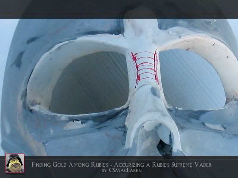
Image

I happen to really, really hate the Rubie's plastic. It doesn't allow for a refinement of shape like Aquamend does. So for me to blow that all away and start over was a good call.


Top
 Profile  
 
 Post subject:
PostPosted: Sun Apr 01, 2007 12:23 am 
User avatar

Joined: Thu Dec 21, 2006 10:46 pm
Posts: 5241
Location: San Jose, CA
With very careful eyeballing of proportions, flow of lines, flow of structure, etc. I sketched the red lines, and then I used a rectangular sectioned Nicholson file to file the grooves.

Image

This was barely a two minute modification!

But the previous modification that allowed for this took several days of extremely careful refinement!


Top
 Profile  
 
 Post subject:
PostPosted: Sun Apr 01, 2007 12:25 am 
User avatar

Joined: Thu Dec 21, 2006 10:46 pm
Posts: 5241
Location: San Jose, CA
Image

The result is much superior to the normal route of filing the plastic alone, or just doing simple patchwork. I'm not saying "superior" because I'm boasting like I'm anyone important, but rather I've actually done the patchwork earlier on in this tutorial, and you could see the results sucked.

This is far neater -- and, get this: it didn't require detail files.

When I try to go in and sharpen already-existing grooves, the detail files unfortunately leave a lot of file marks which require sanding.

In this case, the results are not only smooth, but the rectangles are the right shape based on the width of the file (and then some) and are a direct byproduct of the natural shape of the bridge of the nose I had sculpted.

This is more like the actual prop.

This is far more screen accurate.


Top
 Profile  
 
Display posts from previous:  Sort by  
Post new topic Reply to topic  [ 186 posts ]  Go to page Previous  1 ... 4, 5, 6, 7, 8, 9, 10 ... 13  Next

All times are UTC


You cannot post new topics in this forum
You cannot reply to topics in this forum
You cannot edit your posts in this forum
You cannot delete your posts in this forum
You cannot post attachments in this forum

Jump to:  
Blue Moon by Trent © 2007
Powered by phpBB © 2000, 2002, 2005, 2007 phpBB Group
Hosted by Freeforum.ca, get your free forum now! TOS | Support Forums | Report a violation
MultiForums powered by echoPHP phpBB MultiForums